

Psychology of Color in Logo Designs
Logos are more than just design elements—they’re the front line of your brand’s identity. At first glance, a logo seems simple: a shape, a font, a splash of color. But beneath that simplicity lies psychology. The colors you choose are not just aesthetic—they influence how your audience feels, responds, and remembers your brand. For new businesses, startups, or companies ready for a refresh, understanding the psychology of color in logo design can make the difference between being overlooked and being unforgettable.
Why Color Matters
Color taps into emotions faster than words or images. Studies show that up to 90% of snap judgments about products are based on color alone. That’s because color creates a subconscious association. Think of red and the urgency of clearance sales, or blue and the sense of trust evoked by banks and tech companies. When applied to your logo, color becomes a silent yet powerful messenger.
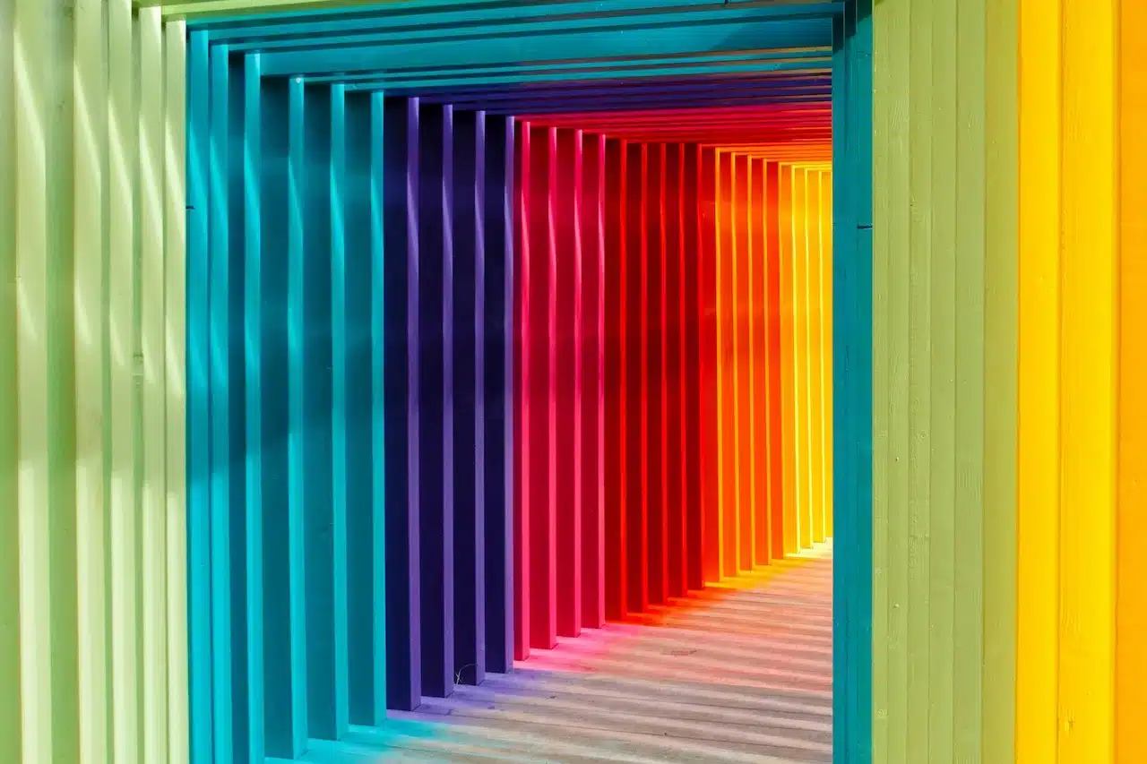
Common Color Associations in Branding
- Red: Energy, passion, excitement. Often used to spark urgency or boldness.
- Blue: Stability, trust, professionalism. Popular with finance, healthcare, and tech brands.
- Green: Growth, freshness, balance. Associated with wellness, sustainability, and eco-conscious companies.
- Yellow: Optimism, warmth, clarity. Perfect for brands that want to feel approachable and fun.
- Black: Sophistication, power, luxury. A staple for premium or minimalist brands.
- Purple: Creativity, wisdom, imagination. Often used by brands with an innovative edge.
Matching Color to Audience
It’s not just about choosing your favorite shade—it’s about aligning with your audience’s expectations. For example, a wellness brand that leans into greens and soft neutrals speaks to health and calm. A cutting-edge startup may gravitate toward vibrant gradients or unconventional palettes to signal innovation.
At Bäst Branding Agency, we guide clients to see beyond trends. It’s not about copying what works for others—it’s about building a palette that communicates your brand’s essence and resonates with your unique audience.
Logo Design Beyond Color
While color psychology is powerful, it can’t stand alone. Shape, typography, and spacing all play a role in how your logo feels. Color enhances these elements, giving your design depth and emotional impact. Together, they form a cohesive identity that connects at a glance and builds recognition over time.
The Bäst Approach
As a boutique agency, we take time to dive into your story, your values, and your goals before selecting a single color. Because fewer clients mean more focus, our process ensures your logo isn’t just visually appealing—it’s strategically designed to attract, engage, and endure.
Ready to design a logo that speaks volumes without saying a word? Let’s build a brand identity rooted in strategy, psychology, and creativity. Start your journey with Bäst Branding Agency today.
Comments are closed.