

Your Mobile Website Is Your New Front Door
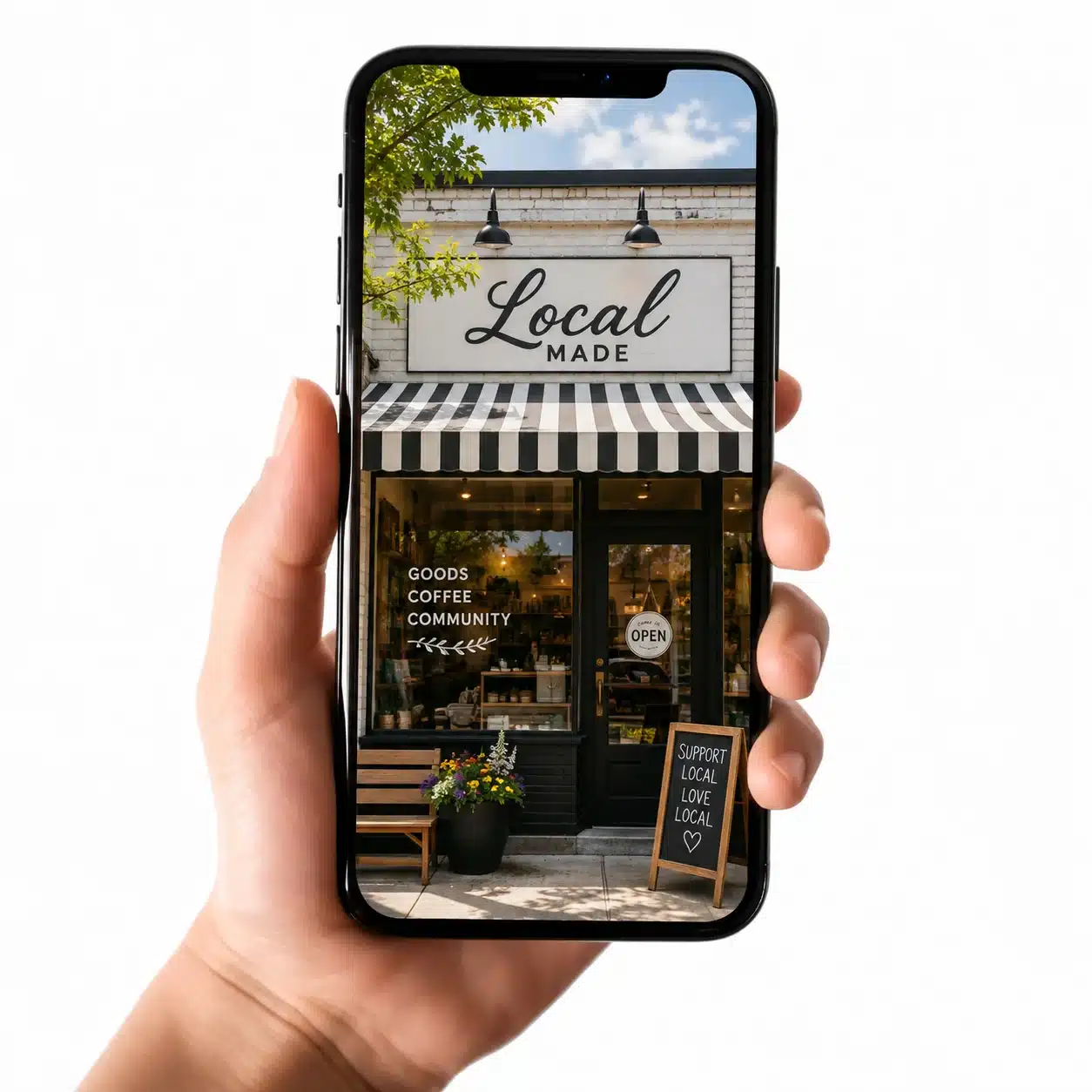
There was a time when a business’s front door was literally the front door.
Customers pulled into the parking lot, walked inside, looked around and decided pretty quickly whether they felt comfortable. Was the place clean? Was someone available to help? Could they figure out where to go? Did they immediately regret not stopping for coffee first?
Today, that first visit often happens long before someone walks through an actual door.
It happens on a phone.
📱 For businesses in Boise and throughout the Treasure Valley, your mobile experience has become one of the most important entrances to your brand. Customers are finding you while sitting in their cars, waiting for appointments, standing in line for coffee, watching a kid’s soccer practice or pretending to listen during a meeting that absolutely could have been an email.
And they are making decisions quickly.
Welcome to Your Digital Front Door
Think about the last time you searched for a local business on your phone. Maybe you needed a restaurant in Downtown Boise, a contractor in Meridian, a dentist in Eagle or somewhere to get your bike fixed before hitting the Greenbelt.
You probably weren’t sitting at a desk conducting extensive research.
You wanted information. Quickly.
You wanted to know what the business did, where it was located, when it was open and how to contact someone. Depending on the business, you may also have wanted to see pricing, read reviews, schedule an appointment or make a purchase.
If the website made any of that difficult, there was another option waiting approximately one thumb movement away.
That’s the reality of mobile.
Your customers aren’t necessarily impatient people. They’re simply accustomed to digital experiences that work.
Mobile Design Isn’t Just Smaller Desktop Design
One of the most persistent website mistakes is treating mobile design as the desktop website squished into a smaller rectangle.
Technically, everything might fit.
That doesn’t mean it works.
A strong mobile experience considers how people actually use their phones. They’re tapping rather than clicking. They’re often navigating with one hand. They may be outside in bright Idaho sunshine. They may be looking for one very specific piece of information and have no interest in exploring seventeen beautifully written paragraphs before finding it.
Mobile UX requires prioritization.
The most important information should be easy to find. Buttons should be easy to tap. Navigation should make sense without requiring detective skills. Text needs to be readable without pinching, zooming or locating the reading glasses that somehow disappear every time you need them.
Good mobile design feels effortless.
And effortless usually requires quite a bit of thoughtful work behind the scenes.
Your Mobile Experience Says Something About Your Brand
This is where mobile experience becomes a branding conversation rather than simply a website conversation.
Every interaction communicates something.
A fast, intuitive website tells customers your business is prepared and attentive. Clear navigation suggests that you understand what customers need. Consistent design reinforces professionalism. Straightforward calls to action demonstrate confidence.
A frustrating mobile website can accidentally communicate the opposite.
That doesn’t mean customers consciously think, “This navigation structure indicates a troubling lack of organizational maturity.”
They simply feel annoyed.
And feelings matter in branding.
🚪 Imagine walking into a Boise business and finding the entrance partially blocked, the lights flickering and nobody quite sure where the checkout counter is. You might still buy something, but the experience has already influenced your impression.
Digital friction works much the same way.
Boise Customers Aren’t Waiting Until They Get Home
Mobile matters everywhere, but it has particular relevance for local businesses.
Boise and the Treasure Valley are active communities. People are moving between Boise, Meridian, Eagle, Kuna, Star and Nampa every day. They’re searching for businesses while they’re already out doing something else.
Someone may search for a lunch spot while walking around Downtown Boise. A homeowner might look for landscaping services while staring at a backyard that has officially surrendered to July. A new Treasure Valley resident may be searching for everything from accountants to veterinarians from their phone.
Your website needs to meet them where they are.
Not later when they get home and open a laptop.
Right now.
Speed Is Part of the Experience
A beautiful website that takes forever to load is a little like having a gorgeous storefront with a door that takes 45 seconds to open.
Eventually, people stop pulling.
Large images, unnecessary scripts, bloated design elements and poor technical optimization can make mobile websites sluggish. And while a few seconds may not sound dramatic, it feels remarkably long when someone is staring at a blank phone screen.
⚡ Performance is part of user experience.
It’s also part of your brand experience.
Customers don’t separate your website infrastructure from your company. They simply know whether interacting with you felt easy or difficult.
That makes speed, usability and accessibility more than technical considerations. They are part of how your business communicates reliability.
Mobile Should Make the Next Step Obvious
Every page on your website should help visitors understand what to do next.
Call. Schedule. Visit. Buy. Learn more. Request a quote. Send a message.
Whatever the action is, it shouldn’t require a scavenger hunt.
This becomes especially important on mobile because screen space is limited. You don’t have the luxury of displaying everything simultaneously, nor should you try.
Strong mobile UX creates a natural path through the information.
The visitor arrives with a question. Your website provides an answer. Then it offers a logical next step.
Simple.
Not boring. Not stripped of personality. Just clear.
Test Your Website Like a Customer
One of the easiest ways to understand your mobile experience is to stop looking at your website like the person who owns it.
Pick up your phone and pretend you’ve never seen the business before.
Can you immediately understand what the company does? Can you find the phone number? Is the menu intuitive? Can you read the text comfortably? Are buttons easy to tap? Can you complete the most important action without becoming irritated?
Better yet, ask someone who didn’t help build the website.
Business owners know where everything is because they’ve seen the site approximately 4,000 times. Customers don’t have that advantage.
Fresh eyes reveal friction.
Your Front Door Should Feel Like an Invitation
Your website doesn’t need to entertain visitors for half an hour.
It needs to welcome them.
It should answer their questions, communicate who you are and make interacting with your business feel simple. That’s especially true on mobile, where first impressions happen quickly and distractions are everywhere.
At Bäst Branding Agency, we see mobile experience as part of the larger brand experience. Great UX isn’t about making something merely look good on a smaller screen. It’s about understanding how real people interact with your business and removing unnecessary obstacles along the way.
Because your next customer may never begin their relationship with your company by walking through your front door.
They may begin with a phone in one hand and a coffee in the other.
Make sure the door is open.
Is Your Digital Front Door Really Open?
Let’s take a closer look at your mobile experience and create a website that works as well for your customers as it does for your business. BBA can help!
Comments are closed.